Substrate mirror — what the Astro foundation actually defines
Build Tracker
Every specimen below is styled by app.css alone — the same sealed
classes the live pages use, so one CSS edit updates this catalog and the
live site together. It's a mirror, never a hand-rolled copy; if something
looks wrong here, the substrate is wrong. Read it top-down as a build-a-page guide:
§1–§2 foundation (tokens + base elements) →
§3–§11 the atom & component vocabulary (forms, buttons, tags,
editorial, status, nav, cards, section patterns) → §12–§20 templates,
which compose those atoms into each page type. An atom used on only
one page is documented in that page's section. Nothing is sealed until you walk it
and say so.
Item tags in the lists below — ✅ in Astro app.css ·
🔜 sealed in staging, not yet ported ·
⚰️ staging relic (was being retired — don't port).
⚠️ These notes record what an implementer believed staging
looked like — they can be wrong (some were written from the STALE
~/Sites/cnxlocal mirror). The source of truth is DEPLOYED
staging.cnxlocal.com —
verify against the live rendered page + its output.css
before trusting any entry here. See CLAUDE.md §"WordPress
design reference".
Brand assets
🟠 Awaiting review
Long wordmark (horizontal — no mountain mark)
long · default (ink)Use on parchment / light surfaces. cnxlocal-logo-long.png
long · colorHero / marketing surfaces where the brand needs to feel warm. Sparingly. cnxlocal-logo-long-color.png
long · white reverseUse on --color-dark surfaces (footer, modals, photo overlays). cnxlocal-logo-long-white.png
Square mark (full identity — mountain + plane + wordmark)
⚠ --color-primary (#057080), --color-primary-dark (#044d57) and --color-ink-light (#557073) are deliberately darkened from the sealed staging values for WCAG AA contrast — keep. --color-accent-dark reverted to the sealed #d09a0f.
Ink + surface
ink-mid#3a5a5e
ink-light#557073
white#ffffff
borderrgba(0,39,43,.1)
Status + Astro-only — error · focus · season palette
This is a paragraph of body copy. It contains a prose link with the gold highlighter that grows on hover. The body face is Source Serif 4 at 1rem with a 1.75 line-height.
A second paragraph to confirm the margin-bottom rule, plus a second link for hover-state grins.
Inline elements
This shows strong, emphasis, inline code, highlighted via mark, HTML, and small text — plus a key like Esc or Ctrl + K.
Icons render via Material Icons here; live consumers (Search.tsx / Showtimes.tsx) use the FontAwesome equivalents.
§8. Navigation
🟠 Awaiting review
.breadcrumb.pagination.toc + .toc-title (+ .active) — Astro addition (article scroll-spy nav).skip-link — focusable; tab into the page to see it slide down from the topSkip to content
Eat like a local for the price of coffee back home
Khao soi, boat noodles, papaya salad — every neighborhood has a stall doing one of them better than the place down the street. We'll point you at the right ones.
✅ Done
.card family (.card-lift, .card-img-block + .c-*, body/title/excerpt/meta/tags, .card-cta)
FLAG: featured .card-title 1.6rem vs staging 1.75rem; .card-meta 0.7 vs 0.72rem — confirm.
§10. Site chrome
🟠 Awaiting review
Site header — the REAL <SiteHeader> component (the exact one BaseLayout renders on every page), fed by the shared buildNavItems() from ~/lib/nav.ts. No hand-rolled copy — edit the nav in one place and it updates here too. Shown in-flow via the showcase prop (the live header is position:fixed); hover Articles / Map / Tools to open the real mega-menu. The transparent-over-hero state is this same element's scroll variant — walk it in situ on a hero page.
Site footer — the REAL <SiteFooter> component (the exact one BaseLayout renders), incl. the Explore-column Search button that opens the live SearchModal (rendered just below so the search works here too). Footer nav is its own thing — topic columns, separate from the header nav.
Logos — header white wordmark, footer colour wordmark
⏳ Pending / deferred
Header band + mega disclosure + mobile drawer stay utility chains — reviewed in situ (hover Map/Tools on home)
⚠ Debt
Mega menu + scroll-state + mobile drawer are Astro-ahead chrome for Kris's functional menu (guardrail 1c) — KEPT.
.skip-link + .footer-link diverge from staging for a11y/AA — KEPT; .pillar-card layout RESOLVED — it is the homepage dispatch tiles (intent-routing); <sm it stacks icon + title above the body copy (was a 2-col icon|body reflow).
Footer column headings are a hand-rolled chain — candidate .footer-heading.
§11. Section patterns
🟠 Awaiting review
🏛️ Hero variants
The cross-template heroes live here: .hero--page (the standard 55vh page header — eyebrow + h1, optionally + .hero-sub / .hero-actions) and .hero--ink (the archive / search ink band). Single-use heroes are documented where they're used: home → §18, landing → §13, article → §14. Shown at representative heights (inline height — build-tracker is allowlisted for inline style, §function not drift).
.cta-video — the video variant of the band CTAs: a full-bleed looping <video> under a bg-dark/60 overlay. Gold eyebrow (.text-accent); the h2 + .lead are auto-whited by the sealed dark-surface inversion (no per-element text-white). Used once, on the consultation landing.
Ready when you are
Put That Expertise to Work for Your Family
One focused hour — $100, money-back guaranteed. Leave with a clear, personalised plan for your family's move.
Before kids, a motorbike was all we needed. These days we drive a Honda CRV and live in the suburbs. Your setup depends on where you land — but the details matter with kids in tow.
⚰️ Relics — do NOT re-import: .hero-landing (≠ Astro's .hero--landing), .brushstroke-cta, tear effect (.tear-*) — retired in staging 2026-06-03.
§12. Standard page template
🟠 Awaiting review
Page-template layering — pages aren't hand-coded from scratch; they're built from a shared base. BaseLayout is the universal chrome base every page wraps (<head> + SEO · SiteHeader · SiteFooter · <main> + skip-link). BasePage (layouts/BasePage.astro) sits on it as the standard content base for plain pages — fixed-header clearance + .section rhythm + .section-inner measure + optional <h1> + a .body-prose slot — mirroring staging's page.php. Richer templates (the post §14, the landings §13, hero + directory pages) sit on BaseLayout directly with their own structure.
BasePage — single column, reading measure (760), plain h1, prose. What /privacy-policy + /terms render.
Privacy Policy
A standfirst paragraph sets the page up at the reading measure.
A section heading
Body copy runs the site-standard reading column — the same prose the article body uses; links, lists and headings inherit the §2 base styling.
✅ Done
BaseLayout — universal chrome base (every page): <head> + SEO · SiteHeader (§10) · SiteFooter (§10) · <main> + skip-link.
BasePage (layouts/BasePage.astro) — standard content base for plain pages: header clearance + .section rhythm + .section-inner measure (--reading 760 default · 1100 · --wide 1200) + optional <h1> + .body-prose slot. Mirrors staging page.php; used by privacy + terms.
.section primitive + .section + .section adjacency · all --container-* tokens (byte-aligned to staging) · Tailwind v4 stock breakpoints.
Distinct templates sit on BaseLayout directly: hero pages (.hero--page — /about, /contact) · directory pages (kids / coworking / neighborhoods) · the post (§14) · the landings (§13).
⏳ Pending / deferred
page.php-era patterns — adopt or retire per page
.section-header — promote to §11 once a callsite ships
PDF atoms not in app.css: .section-header, .cta-photo--profile — port when a callsite needs them.
--container-420 is an Astro-only step.
§13. Landing page template
🟠 Awaiting review
📌 Landing atoms — ported from staging §13, for review
Landing hero — base .hero + min-h-screen (no .hero-- modifier): FULL-vibrance photo (no .hero-photo dim), custom gradient, 2-col with the offer card pinned right. Same composition as staging page-webpack-offer.php. Used across the landing pages.
One hour · $100 · Money-back
Book a One-on-One Consultation
Navigate your family's move to Chiang Mai with confidence.
FAQ accordion — the live landing pattern: border-divided rows; each row is a full-width button (League Gothic uppercase question + a chevron that rotates 180° when open); the answer is an Alpine x-collapse panel. First row shown open.
Frequently asked
Questions
Yes — get in touch through our contact form and we’ll share the details.
Newsletter widget — a .card shell; the form itself is a provider embed (MailerLite) on real pages. There is no dedicated .cta-newsletter DS class in staging — it's a card + embedded form.
Stay in the loop
Stay Updated
Sign up to get notified when we publish articles and updates.
FAQ shown in the live accordion style (border rows + rotating fa-chevron-down); on real pages it's an Alpine x-collapse disclosure (static here).
Newsletter form is a provider embed (not a DS class) — wires up on real pages
⚠ Debt / flagged divergences (KEPT)
§14. Post — standard
🟠 Awaiting review
📄 Single-post components
.hero.hero--article — single posts; photo + tag overlay + floating .hero-title-card (h1 + date · read · author). Shown shrunk via .bt-fit.
Expat familiesHow To
Getting Around Chiang Mai: A Family Transportation Guide
March 20, 2026·10 min read·Lily Szabo
.post-banner — any photo as a uniform wide band (~3.34:1, object-cover). Add the class to a body image..post-banner.post-banner--titled — the h2 lives in the band (photo + ink overlay + overlaid white title)
Coffee, Food & Experiences
.post-banner--titled.post-banner--tall — taller crop (4:3). The three blog h2 styles: pure text · banner photo · tall photo.
How We Hired Our Nanny
.toc + .toc-title — sidebar TOC; active item highlighted by the scroll-spy (first row shown active)
In This Article
📰 Article footer components
.breadcrumb (§8) — rendered after the article bodyAuthor bio — utilities + the sealed .polaroid avatar (§9, square crop) + .tagline (Reenie Beanie) role; sits on the parchment, not a card. 2026-06-27: componentized as AuthorBio.astro, now per-article (Lily / Kris / Zach Price from data/authors.json, photo from public/authors/<slug>.jpg with an initials fallback) and rendered on BOTH the standard and map_aside post templates with a subtle body→author divider.
📐 Composition patterns (recipes) — adapt to your data, don't reinvent
.quick-facts — at-a-glance facts panel (handwritten title · key/value rows). Scoped to .body-prose.
Quick Facts
Visa Duration5 years
Stay Period180 days / entry
Visa Fee~10,000 THB
Apply100% online
🟠 Awaiting review — .quick-facts--single modifier: drops the 2-column newspaper flow to a single full-width column so long, sentence-length values use the whole card width (the default cramps multi-line values). First: the international-schools guide.
Quick Facts
Typical annual tuition฿280,000–฿900,000 (~$8,200–$26,500) for full international schools; bilingual options start lower
Biggest decision factorsCurriculum alignment with future uni plans, commute, budget, and waitlists
Typical student body200–600 students, 25–40+ nationalities per school
Reading-column 640-vs-760 decision is OVR-001-gated (see §2 note)
⚠ Debt / flagged divergences (KEPT)
pages/[slug]/index.astro L391/L423 — max-w-[1068px]/[1004px] per-page overrides of --container-1200/§12 default 1100; promote to tokens or accept (Lily)
§15. Post — map aside
🟠 Awaiting review
🗺️ The map column — fixed full-height panel (desktop)
Derives from §14: same hero/prose/footer, narrowed into the left reading column beside a top-to-bottom map panel on the right. The map is Astro's Leaflet panel on Mapbox tiles — it now renders AND functions in situ: hover shows a name chip, click scrolls the article to that block (no link-out), with a light jade wash under the geometry. Spec below. 🟠 Conventions good-enough for launch; seal after.
Hero in the map-aside context — §14's .hero--article + .hero-title-card narrowed into the left reading column (≈60%), beside the map panel (≈40%, placeholder)
ParksOutdoors
(Map)
Point marker — small at rest, larger on focus; hover brings it to front + shows the name chip; click scrolls the article to that place (the map does not move). Resting · focused:
Cursor hover-label (.cm-map-label) — .card-tag type on a white paper pill (ink text, not the filled chip)Nong Buak Haad ParkArea polygon (neighborhood maps) — teal fill/outline at rest (--color-primary), gold on hover/active (--color-accent)
📍 Place-listing card — recipe, the .cnx-place block
One paper card: photo flush on top, hairline-divided meta footer (hours · price · location — gold icons, teal links), decorative .tagline subtitle below. Title heading level set per block via .cnx-place--h2…h6 (defaults h3). Ported staging → app.css.
.article-map-aside-page / -main / -body / -rail grid · .cm-marker (+ -hovered/-dim) marker states · .map-aside-shell family
Map now renders + functions (Astro Leaflet): Mapbox streets-v12 tiles · jade wash on a pane UNDER polygons/markers (non-interactive) · location-icon.png markers (enlarge on select) · teal 0.2 → gold 0.4 polygons · .cm-map-label hover chip = .card-tag on a paper pill (name only)
Map↔article sync: identity coupling (data-place-slug/data-hood-slug) — hover = name chip, click = scroll the article to that block (CLS re-align), no link-out from the map
Unified neighborhood block (data-driven AND transplant): heading (name only) → Reenie .tagline → large photo → highlights card if available
.cnx-place card recipe ported staging → app.css; meta footer now League-Gothic, one-line icon+value rows, links sit in the meta colour + darken to ink on hover (card-meta link convention)
Per-neighborhood directory links removed; an occasional .related-card callout (CNX_ARTICLE_REF marker, §5) links to a deep-dive guide where one exists
⏳ Pending / deferred (🟠 seal post-launch)
ContentMap basemap matrix (streets-v12 article · light-v11 directory · cafe · homepage relic) — decide whether jade + card-tag hover chips extend to directory/cafe maps, and unify the selected-marker (enlarged pin vs gold teardrop)
Neighborhood record name is verbose in the source (SEO title); cleaned in code for now — fix at the source post-launch (also tidies map tooltips)
⚠ Debt / flagged divergences (KEPT, not force-aligned)
location-icon.png marker asset ported from staging; shown at resting 30px · focused 46px
Split ratio 58.33/41.66 vs staging --map-col:40% (60/40) — flag
Map is sticky-below-nav vs staging FIXED-above-nav (would require touching Kris's nav, guardrail 1c) — KEPT
Mobile order is map-below-article vs staging map-above (optional order:-1 fix) — flag
Polish pass (2026-06-27): capped at max-w-900 (1100 sprawled on large screens), excerpt clamped to 2 lines, and the horizontal-card grid is the shared browse-list treatment (.post-cards-container): 1-col → 2-col (≤md) → 1-col (≤480). At ≤480 the photo caps at a 200px banner with no excerpt. Same recipe as /articles "Latest" + search. See docs/lily-design-system.md.
The WIRED archive template — this renders the REAL <ArchiveListing> fed a live 3-article slice, NOT a hand-mock, so it cannot drift from /category/expats/ · /category/guides/.
Expats
CNXlocal is your trusted guide to life in Chiang Mai.
Thirty real ways to fill a day in Chiang Mai with kids without spending much — honest about which are truly free and which run a few baht, with practical notes and no padding.
Discover the new Destination Thailand Visa (DTV) for digital nomads and remote workers. Learn about this 5-year multiple-entry visa, its eligibility criteria, categories, and application process. Perfect for long-term stays in Thailand.
Updated July 25, 202630 minute readLily SzaboRead More
Close to 20 international schools, one genuinely hard decision. A Chiang Mai local's lay-of-the-land on curricula, fees, locations, and how to choose the school that actually fits your family.
Template & nesting. The wired archive is ONE shared body — ArchiveListing.astro — consumed by every archive route (/category/<slug>/, /author/<slug>/, tag + date archives) and the search-results page; it mirrors DDEV's template-parts/posts-archive.php. Each route is a thin page wrapper (pages/category/[slug]/[...page].astro, …) that fetches + paginates, then NESTS <ArchiveListing> inside <BaseLayout>. Full nesting: BaseLayout → ArchiveListing → ArchiveCard (server wrapper, zero-JS) → ArticleCard.tsx. The card markup lives ONCE in ArticleCard.tsx (shared with Search) — edit the sealed design there, never re-implement it.
Hero. Compact ink band .hero.hero--ink → .hero-overlay + .hero-content → <h1 class="hero-h1"><em>{title}</em></h1> (title italicised, build-time-curated via archiveTitle(slug)) + an optional .hero-sub line. Matches DEPLOYED staging /category/*. ⚠ The mirror's centered archive.php header is a STALE draft — do not chase it.
Chips (.card-tags). Horizontal archive cards show ALL their categories — NO cap (vertical cards cap at 3 per §5). ORDER: the three umbrellas nomads → expats → visitors sort to the front (UMBRELLA_ORDER, stable); the rest keep source order. COLOUR: base .card-tag is the filled-ink chip; only the umbrellas add colour via .card-tag--{nomads|expats|visitors} = teal / gold / jade; every other category still gets a .card-tag--{slug} class but falls back to filled ink. Blanks + uncategorized dropped. Built by cleanCategories + cardTagClass + prettyCategory (lib/text.ts); each chip is its own link to /category/<slug>/.
Excerpt. Authored excerpt when present, else a WP-style auto-excerpt (~55 words, deriveExcerpt(body_html, 55)) — most imported posts have an empty excerpt, so the card would otherwise be blank. Rendered italic + un-clamped.
Card body + pagination. Image-left md:w-5/12 (auto-aspect) + body md:w-7/12, stacked on mobile; whole-card click (.card-stretch), no button. Read-time chip counts body prose + per-place write-ups. First card eager-loads, the rest lazy. .pagination/.page-btn renders only when >1 page (buildPagination) — the strip above is a 3-page demo (real hrefs on the live route).
OPTIONAL featured-grid layout still under review (NOT the wired archive layout above)
Tracker §16 renders the REAL <ArchiveListing> (live articlesInCategory(..,'expats').slice(0,3)) — no second copy of the markup, so this specimen can't drift from /category/expats/. Chips · hero · nesting documented in the notes above.
Archive cards rebuilt to LIVE staging: full-width horizontal card (image-left md:w-5/12 auto-aspect + body md:w-7/12, stacked on mobile), italic un-clamped excerpt, 1.2rem title. Was wrongly capped at 760 + centered.
Category chips = LIVE staging: filled ink chip; .card-tag--nomads/--expats/--visitors brand-colour umbrellas (teal/gold/jade), sorted first, all shown (>3). Reverts the earlier mistaken ink-outline restyle — site-wide across §5/§9/§15/§16.
Archive header = .hero--ink (ink band: h1 + sub) — matches deployed staging /category/*. (The local archive.php centered-header draft is stale/unshipped — do not chase it.)
Search is Kris's Pagefind setup (Search.tsx + its own .hero--ink band) — left as-is. Astro-ahead of staging's WP search.php; do not rebuild.
§17. Articles listing
🟠 Awaiting review
The "Start Here" articles index (built June 24): hero → cornerstone .articles-grid (most-popular) → ink "Latest" band (full-width horizontal cards) → audience folder-tabs → topic .benefits-grid.topic-grid → closing photo-band CTA. Walk it in situ: /articles.
Polish pass (2026-06-27): the featured .articles-grid now steps lead+2×2 (lg) → 3×2 (≤lg, with a 6th tablet-only .articles-grid-extra card) → 2×2 (≤md) → single column (≤480, where the photo caps at a fixed 200px banner and the excerpt is hidden). The ink "Latest" band now matches the archive browse-list treatment (.post-cards-container, max-w-900, 2-line excerpt clamp) and shows 4 articles so the 2-col band fills as a 2×2. Cards carry a user-icon byline — author photos live only on the end-of-article bio card. Full reference: docs/lily-design-system.md.
.lane-tab + .lane-card + .lane-blurb + .btn.lane-cta — audience folder-tabs. Each lane's brand colour + readable ink is set by data-lane (expats=gold · nomads=teal · visitors=jade); the active tab carries its colour and overlaps the card it opens into. (Defined in app.css, not a page <style>.)
For families putting down roots: schools, healthcare, neighborhoods, and the everyday logistics of running a household with kids in tow.
Hand-composed page on sealed atoms: cornerstone .articles-grid (featured lead + 2×2) · ink "Latest" full-width horizontal-card band · audience folder-tabs · topic .benefits-grid.topic-grid · closing photo-band CTA.
New page-scoped atoms (now in app.css, not a page <style>): .lane-tab / .lane-card / .lane-blurb / .btn.lane-cta / .topic-grid.
Editorial model: LANE_CURATION (hand-curated best-6 per lane in a relocation-journey order) + first-umbrella lane placement (category order decides the lane).
⏳ Pending / deferred
Whole page 🟠 awaiting design review + seal.
⚠ Debt
Lane folder-tab + topic-grid are articles-only atoms — on seal, confirm whether they generalise or stay page-scoped.
§18. Homepage
🟠 Awaiting review
The homepage is a situational dispatcher (rebuilt June 24): .hero--home with the LiveDataStrip island (live time / weather / AQI / FX — not the static .cnx-ticker) → intent dispatch tiles (.pillar-card) → featured guides (.articles-grid) → consultation + about photo-bands (the About band embeds a .polaroid) → watercolor neighborhood map + .postcard directory row → teal .cta-band with inline MapPackForm → Tools & Applets scroll-row (.card.card-lift + hand-drawn arrows) → sign-off. Walk it in situ: homepage. There is no .benefits-grid on this page.
Explore curated maps and guides. Get expert advice from your CNXlocals.
LiveDataStrip — the hero strip is a live-data island (time · weather · AQI · USD→THB), client-fetched on idle, so it can't render in this static catalog (description only). Replaces the static .cnx-ticker (now unused).Dispatch tiles — route by situation: .pillar-card (§10) + .pillar-link with a frameless, enlarged illustration in the .pillar-icon slot (live site uses an <img>; tracker shows a glyph) + a destination-cue line.
Tools & Applets scroll-row — a horizontal snap-scroll of .card.card-lift tiles flanked by hand-drawn arrows: the #cnx-roughen-arrow SVG feTurbulence filter, an ink-wobble design-language element reused for scroll affordances.
Directory postcards over the watercolor map — .postcard (§9) cards sized down + tilted, tucked over the right edge of the watercolor neighborhood map (page-specific composition; walk it in situ).
.season-strip — year season band, shared by /humidor/ + /planner/ (Kris)
JanAprJulOctDec
Cool
Hot
Wet
Nov–Feb
Mar–May
Jun–Oct
Two recipes (see lily-design-system.md → Tool pages). Funnel tools (Cost of Living · DTV Eligibility Checker · When to Visit · Neighborhood Quiz): short hero--ink + photo → lead → tool → "From the locals" h2 → RelatedGuides routing to the longform guides, so they don't cannibalise guide SEO. Standalone utilities (Showtimes · Area Converter): tool-first + .body-prose supporting content, no funnel. Only functional widget CSS stays page-specific (page-humidor.css, page-planner.css) — chrome, prose and tables come from the DS. Walk in situ: /showtimes · /humidor · /planner · /rai · /visa-calculator · /cost-of-living-calculator · /quiz/neighborhood.
Cost of Living Calculator ported from staging to its own page /cost-of-living-calculator/ (wraps the CostOfLiving island; the COL article links here); old /quiz/budget/ 301s to it.
⏳ Pending / deferred
Each tool reviewed on its own page (showtimes / humidor / planner / area-converter / visa / cost-of-living)
🟠 Astro-only tools beyond staging — keep or cut at seal: DTV visa calc, /tools landing. The neighborhood quiz is now core — it's the funnel target for the neighborhood directory's quiz .cta-band (weights the same 8 rating dimensions; see §21).
⚠ Debt
Page-specific extras live in page-humidor.css / page-planner.css (intentional split, not drift)
The current filter row + chrome live in §21. The live cafe directory adopts the unified .directory-filter-bar (the legacy .filter-menu is retired — see the rendered specimen in §21), the hero now carries a "Reviewed by Kris" Reenie-Beanie eyebrow plus a "Which cafes should I add next?" .cta-band (its button opens the SuggestCafeWidget form via #suggest-cafe), and the modal leads with the shared .cnx-place-meta at-a-glance line (neighborhood · rating · hours · address → Google Maps · website). The .cafes-grid tiles above + the full .cafe-modal-* suite stay valid. Walk it: /cafes.
✅ Done
.cafes-grid (+ item/img/meta/tag/name/hood)
.filter-menu/.filter-item · .cafes-filter-clear · full .cafe-modal-* suite
⏳ Pending / deferred
Cafe modal walked live (gallery / ratings / AQ vote)
⚠ Debt
PDF atoms NOT in app.css: .place-grid, .place-card
Reenie Beanie hero eyebrow — font-decorative + text-accent, over the dark hero
Where to live in Chiang Mai
One design kit across cafes/coworking/kids/neighborhoods: a shared modal shell + full-width filter band, the map-aside layout, jade rank-meters, Reenie Beanie hero eyebrows, .postcard cross-links and teal .cta-bands — all from sealed recipes. The neighborhood directory is the geographic spine; the place directories are hood-keyed layers that cross-link back to it. The full design-language + relationship map is now docs/directory-architecture-synthesis.md (read that first). The CMS strip is done — slug-keyed content layer (lib/content.ts), neighborhood assigned at import. Review in situ: /cafes · /coworking · /kids · /neighborhoods (+ any hood detail).
Neighborhood map ↔ card model (2026-06-27): the map and the card list mirror each other and navigation is deliberate. Hover a polygon → one styled label; hover a card → its polygon highlights. Click a polygon → highlight both (GOLD: polygon fill + card ring-accent) and scroll the card into view. Click a card → highlight both and gently pan the polygon into focus (panTo, no zoom). Neither click navigates — "View more →" is the only navigation (the ListingCard body is a role="button"; the CTA is the lone link). Events: cnx:hood-hover / cnx:hood-select / cnx:hood-focus. See docs/lily-design-system.md.
.rank-meter — score bars, fill = --color-highlight (brand jade, was gold — friendlier/more intuitive for a rating); ONE style shared by the neighborhood card AND its detail page; 8 dimensions from one overlay
Reenie Beanie hero eyebrows (font-decorative + text-accent): neighborhood index, every hood detail (the tagline IS the eyebrow), cafes ("Reviewed by Kris")
.postcard cross-link cards (FontAwesome stamps) at the foot of /neighborhoods → live directories; .cta-band for map-pack / quiz / suggest-a-cafe (the band button drives the island by #suggest-cafe hash)
.quick-facts--compact, .qf-actions, .crowdsource-band (jade air-vote), .body-prose--flat (default prose, no standfirst)
All 4: sticky full-height map; below-grid editorial squished into the content column; owner CTA full-width of that column
Hood DETAIL pages now use the map-aside layout too: that hood's polygon zoomed in the rail, editorial + jade ranks card + places-in-hood down a legible left column, breadcrumb under the hero
Kind facts: coworking amenities+rates · cafes ratings+air vote+beans · kids "Good to know" insider card · map+neighborhood link
Neighborhood cards: Doi-Suthep hero, flush full-height photo, name on top, region chip, Reenie tagline, 8 ranking meters
⚠ Data status (on the content layer)
Photos serve same-origin from R2 (/media + /cdn-cgi/image); hand-added hood/owner photos use /img/... paths — assetImage now passes own-origin paths straight through (they don't go via the media-map). DEV-only proxy in src/middleware.ts for the R2/transform paths.
Scraped facts in web/src/data/directory-overrides.json (git); regen via scripts/scrape-directory-data.mjs
neighborhood-rankings.json = real curated 8-dim editorial scores (was a placeholder scaffold): expat / family / walkability / safety / affordable / cafes&culture / green / quiet — frank lows, text-aligned, safety generally-high with red-light/touristy dings; rationale in docs/neighborhood-ratings-rationale.md. Boundaries are editorial (hand-drawn), not administrative — the page says so.


 Square mark (full identity — mountain + plane + wordmark)






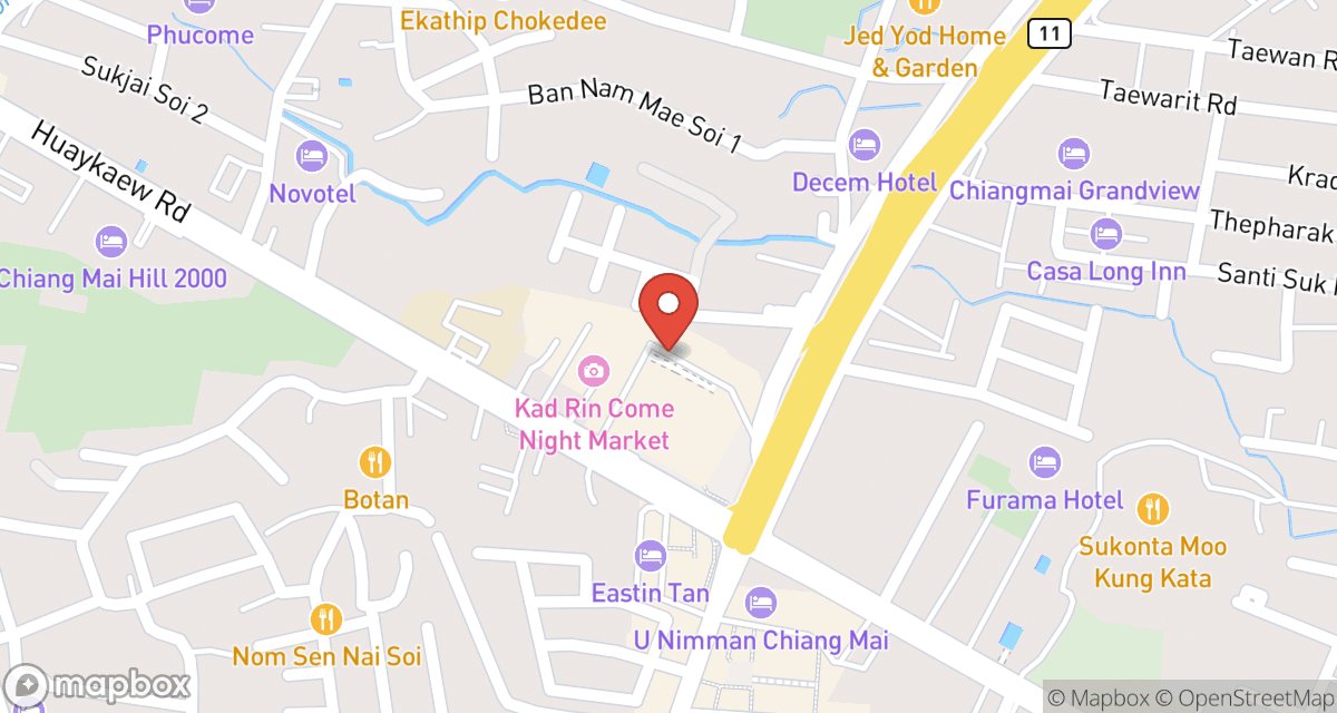
 (Map)
(Map)